

By Mary Pat Campbell, FSA, MAAA
In the current coronavirus pandemic, one of the most impactful pieces of communication has been this:
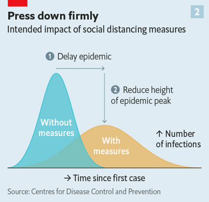 Source: Rosamund Pearce for The Economist. From her tweet of 5 March 2020.
This visualization spawned numerous versions, with the following one, by Alexander Radtke on 11 March 2020
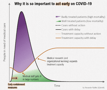 Source: Alexander Radtke from his tweet of 11 March 2020.
These visualizations are based on very simplified models of how pandemics move through a community, and how to string out infections so that healthcare resources are not overwhelmed. This concept was described similarly in a paper by the Centers for Disease Control, in February 2007, titled “Interim Pre-pandemic Planning Guidance: Community Strategy for Pandemic Influenza Mitigation in the United States—Early, Targeted, Layered Use of Nonpharmaceutical Interventions”. It had a very similar graph, early on in the paper.
In all these cases, and in particular, the animated graphic, the metaphor “flatten the curve” caught public imagination – people finally understood action had to be taken to reduce the load: social distancing, closure of schools, and more.
The image of how pandemic cases would grow and overwhelm hospitals got attention and action more than simply quoting numbers of growth rates.
In addition to these “flatten the curve” visuals, there have been countless dashboards, most working off the same data sources, but many taking multiple angles for the results.
Check out some of these dashboards, all of which should be free even if you’re not a subscriber:
There have been many more as well. Good visualizations can convey strong messages, leading an audience to respond and to act. In my own case, looking at modeled COVID-19 dynamics made me realize that when I left work on March 12, I would not be coming back into the office for a long time. When the decision is made to open things up again, I bet visualizations of projected results will be key for decision-makers.
Look at how much one diagram changed people’s behavior…. Why not your graphs, as well? Build that visualization toolbox for yourself!
Join me Wednesday, April 29, 2020 for the webinar: Data Visualization Best Practices for Actuaries
Actuaries need to have the important skill of informing and persuading audiences using good and strong data visualizations. In this webinar I will look at principles and techniques for data visualization, including choosing the best way to display your data. All examples will be in Microsoft Excel, though the specific software you use is not as important as being clear on principles for being effective with calling your audience to action.